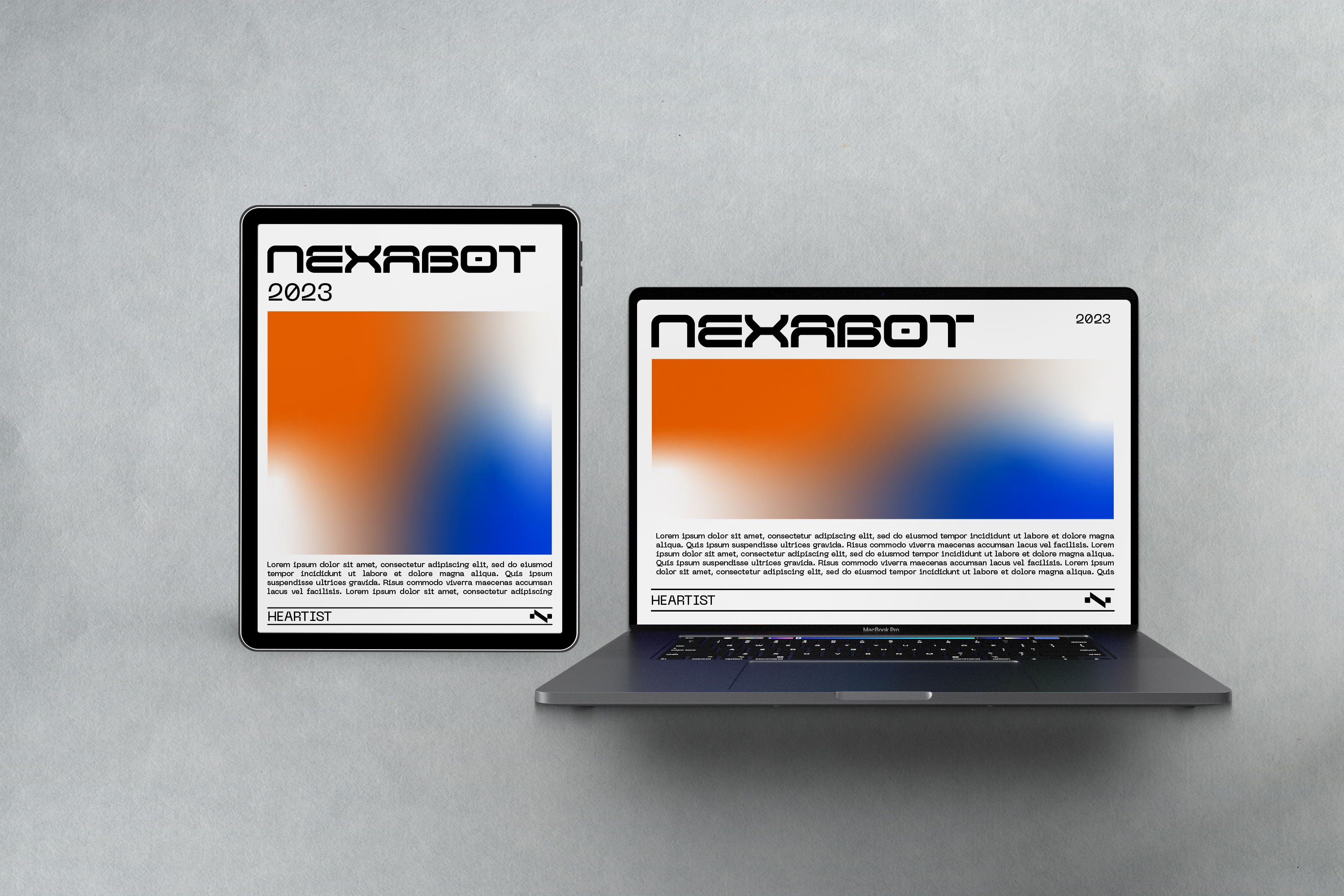
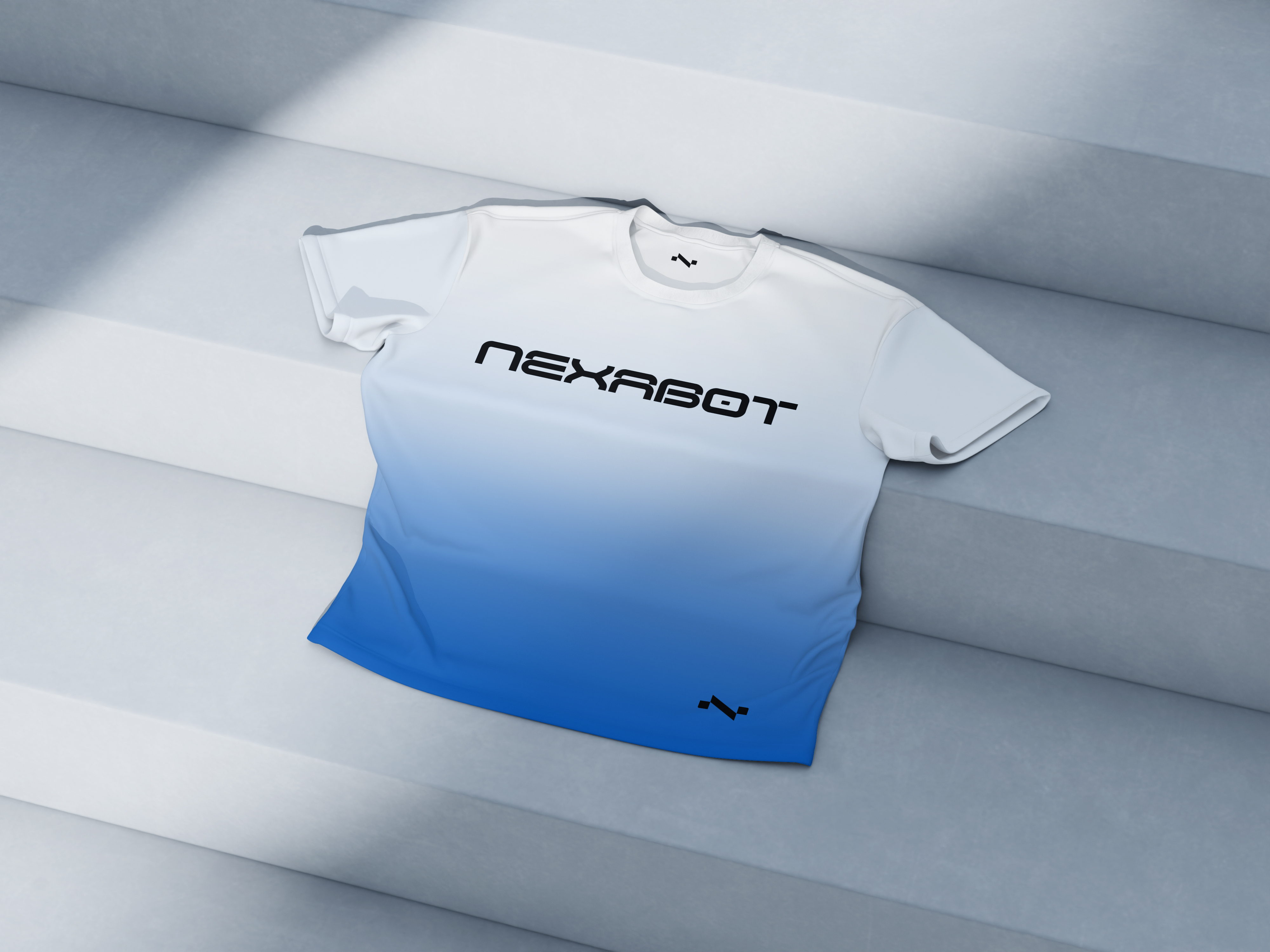
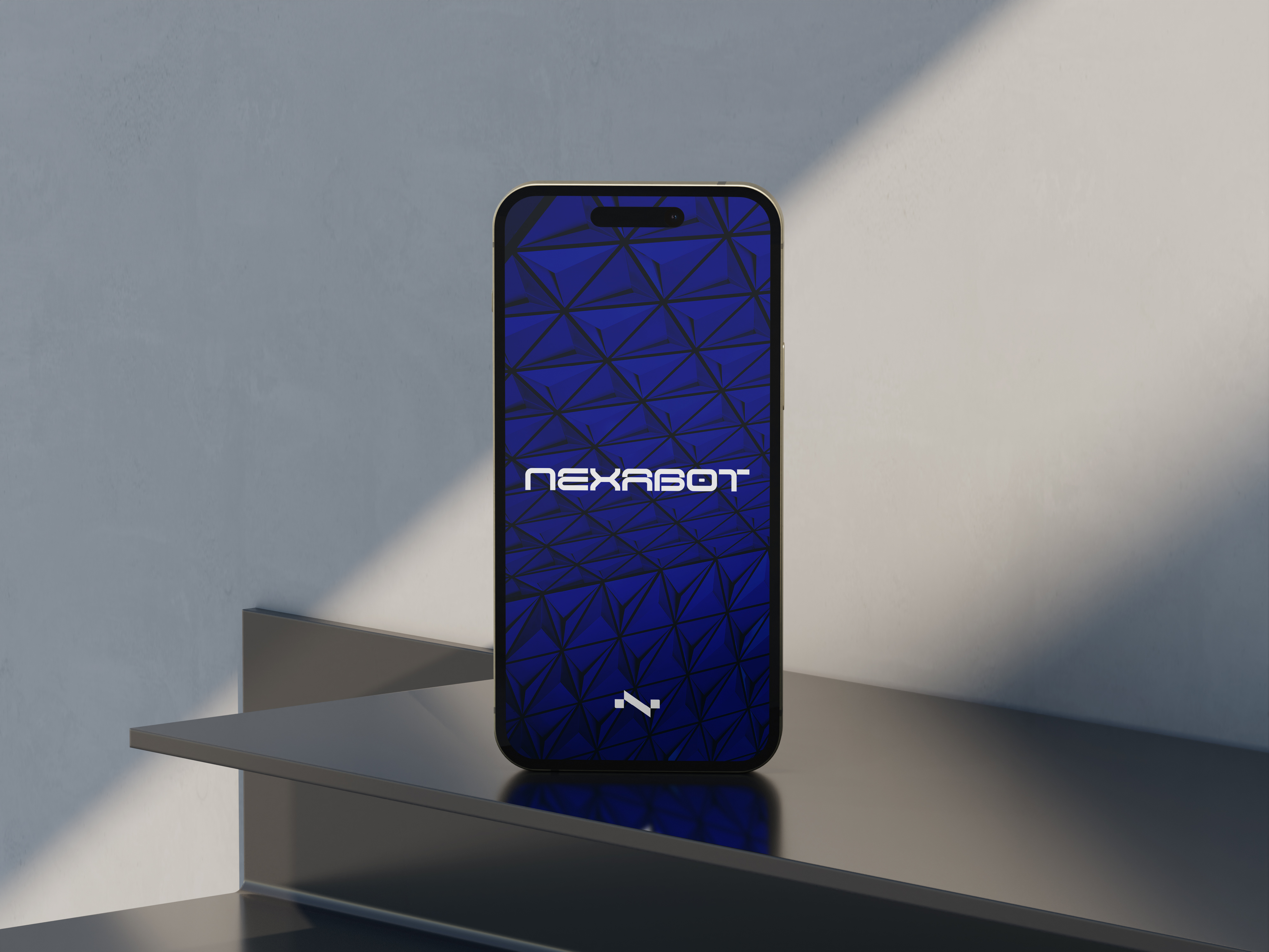
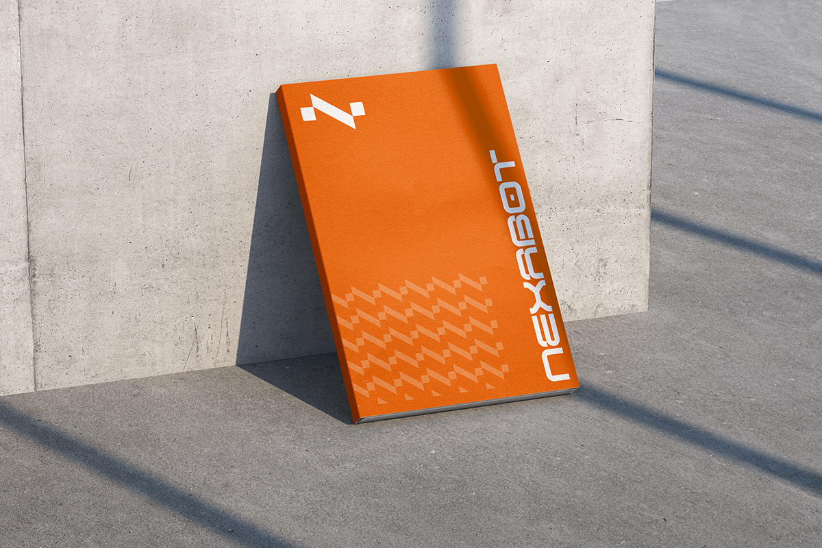
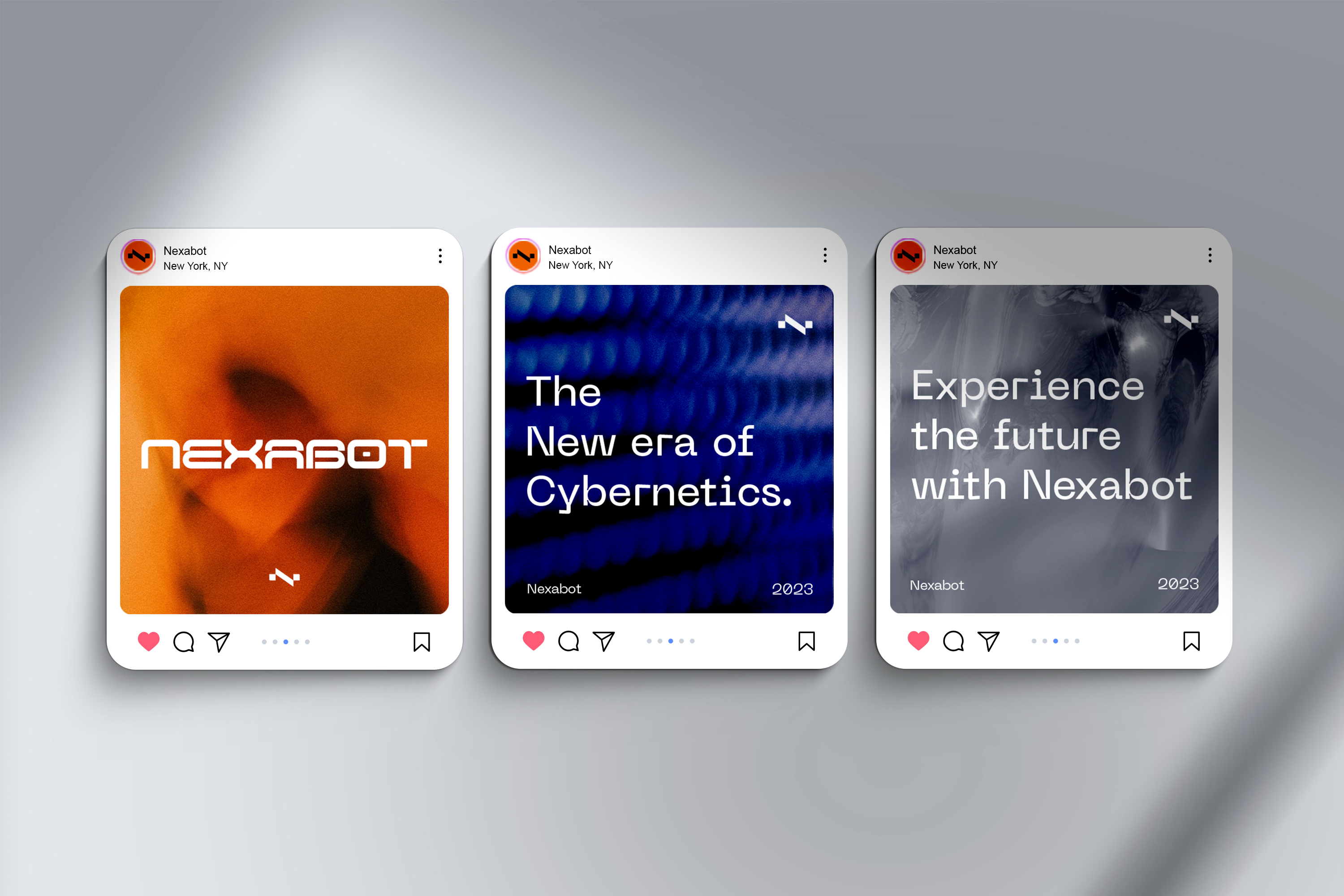
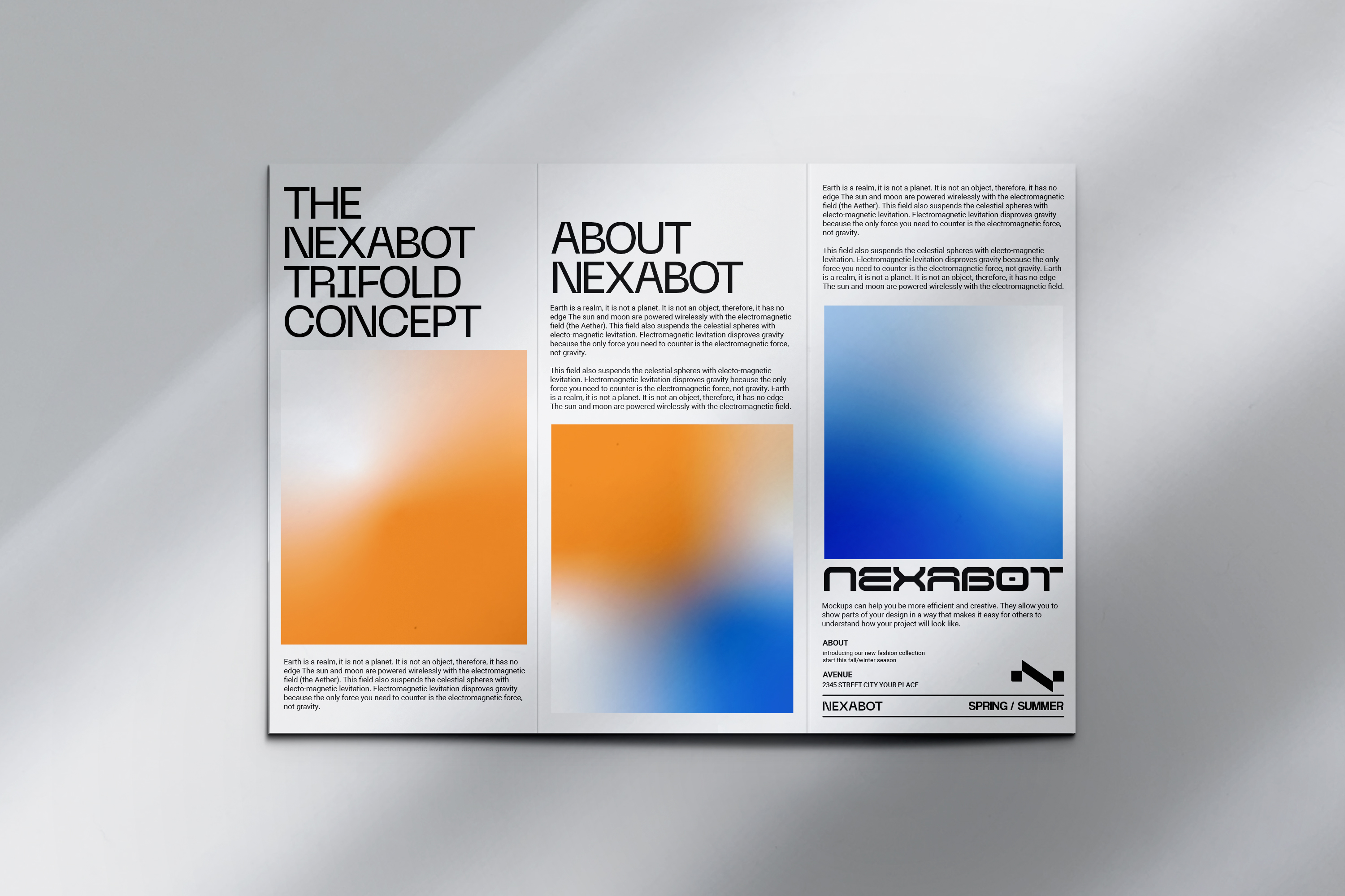
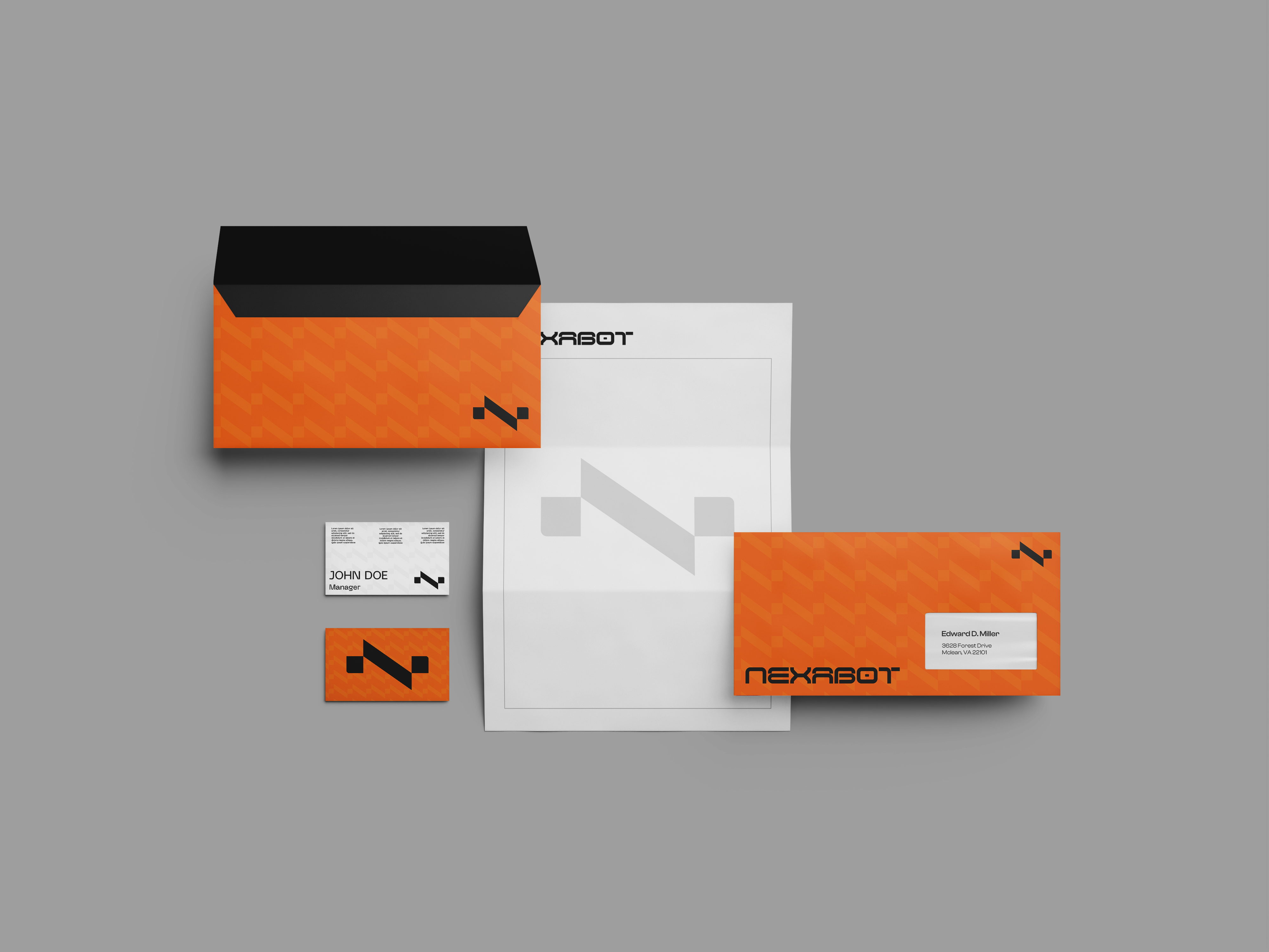
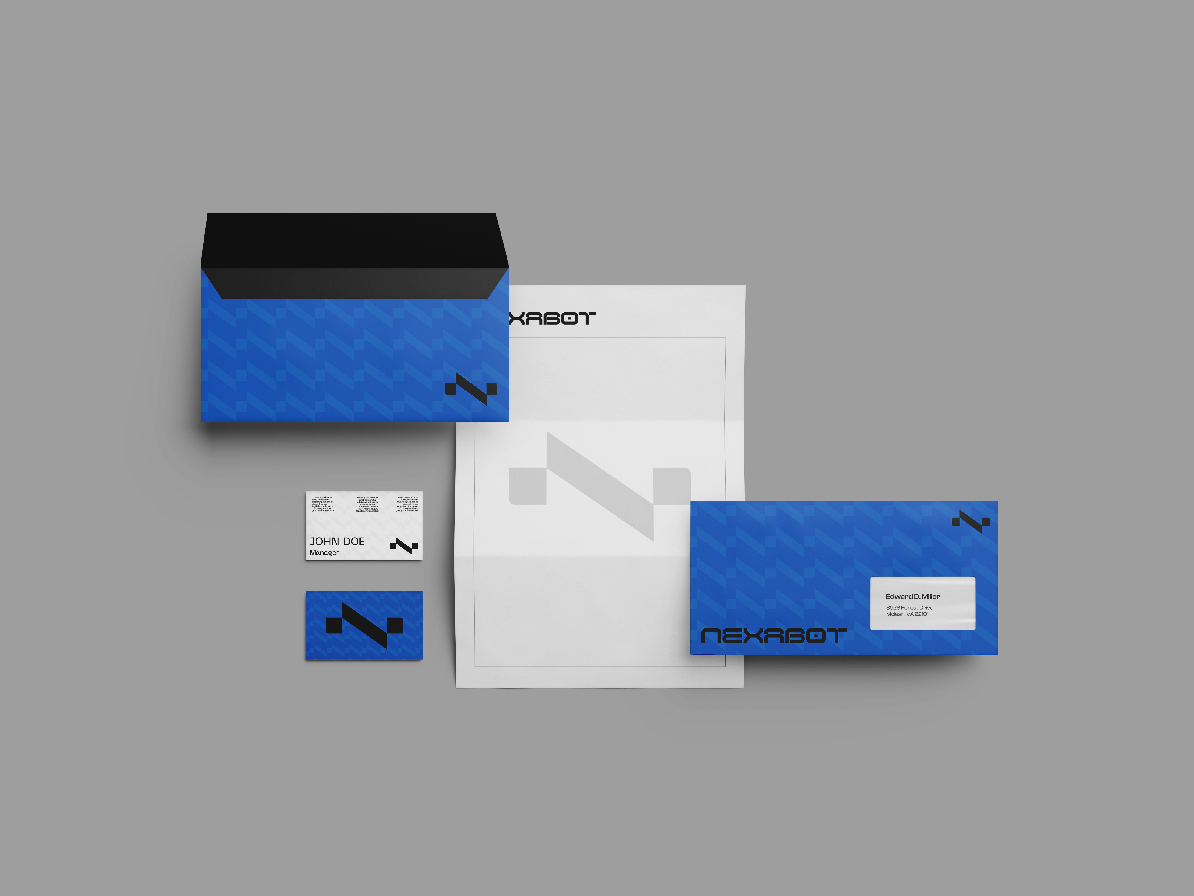
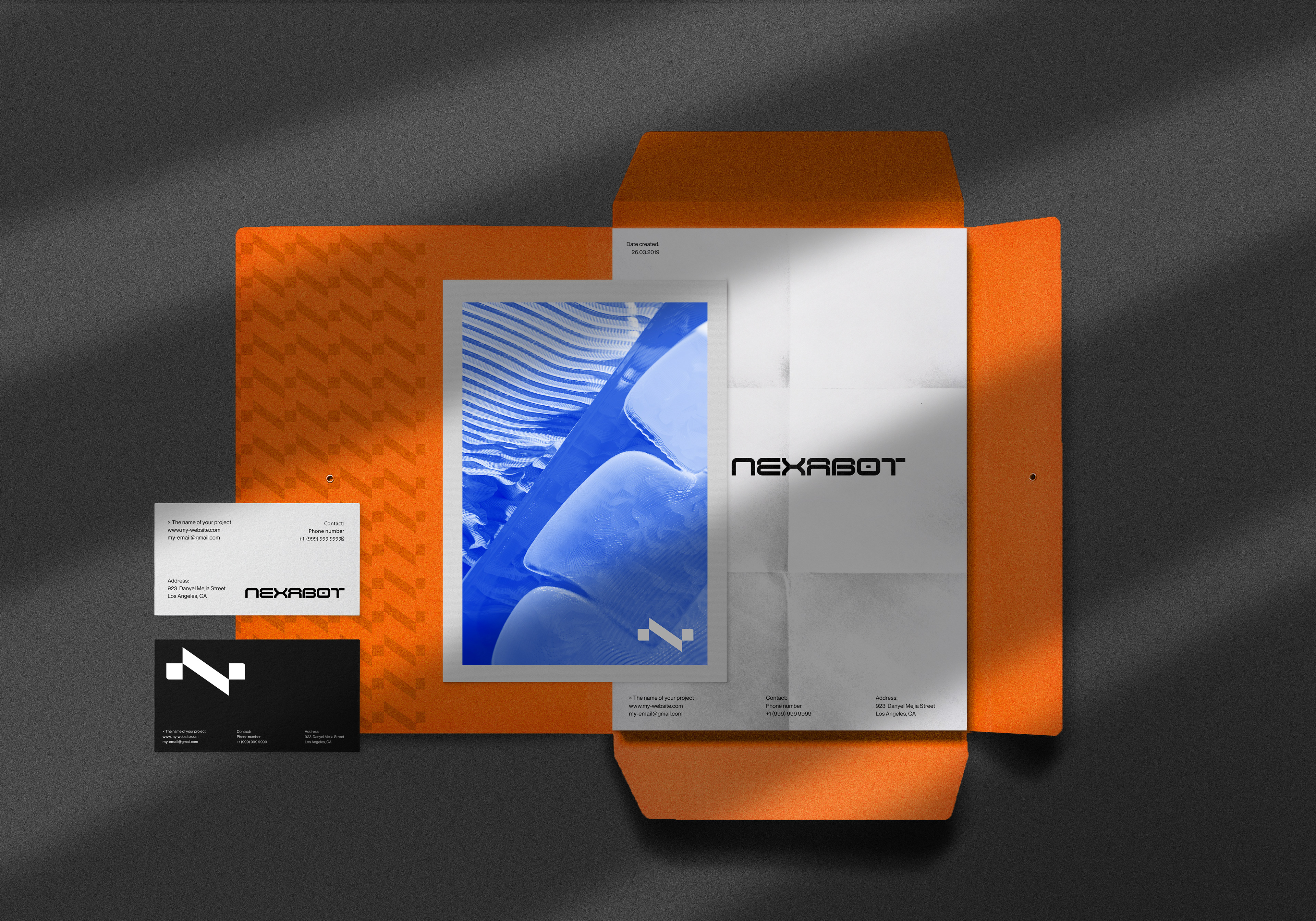
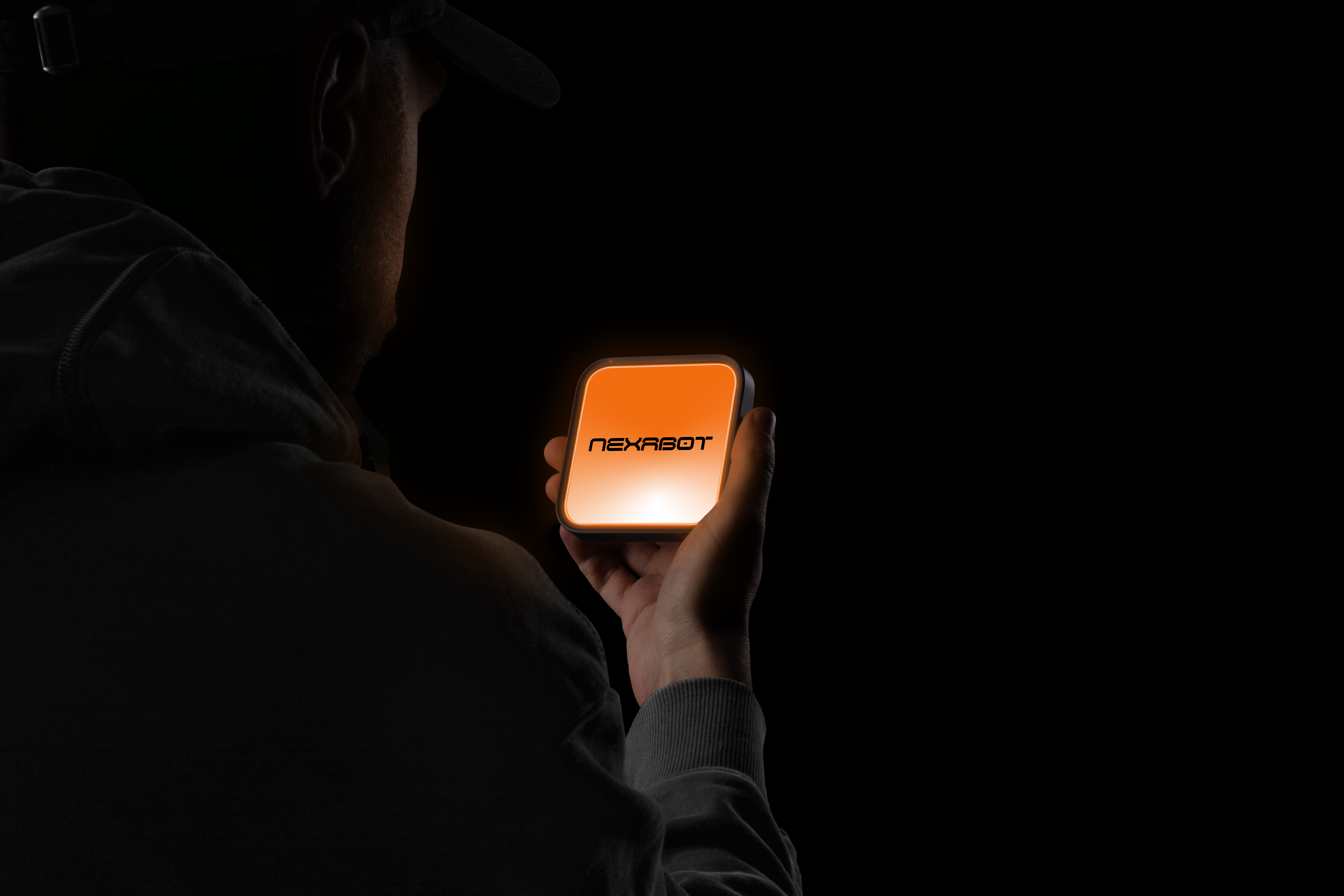
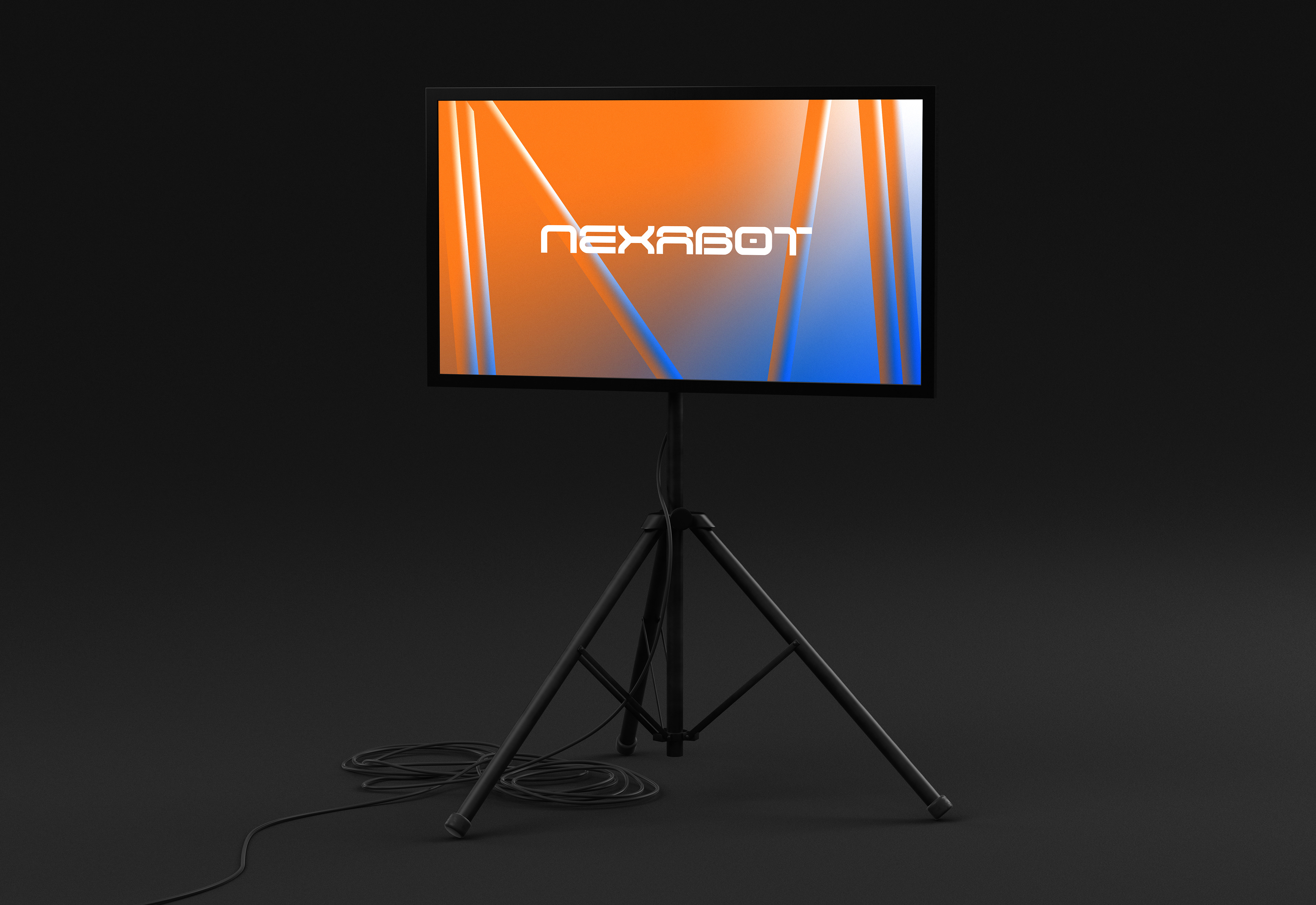
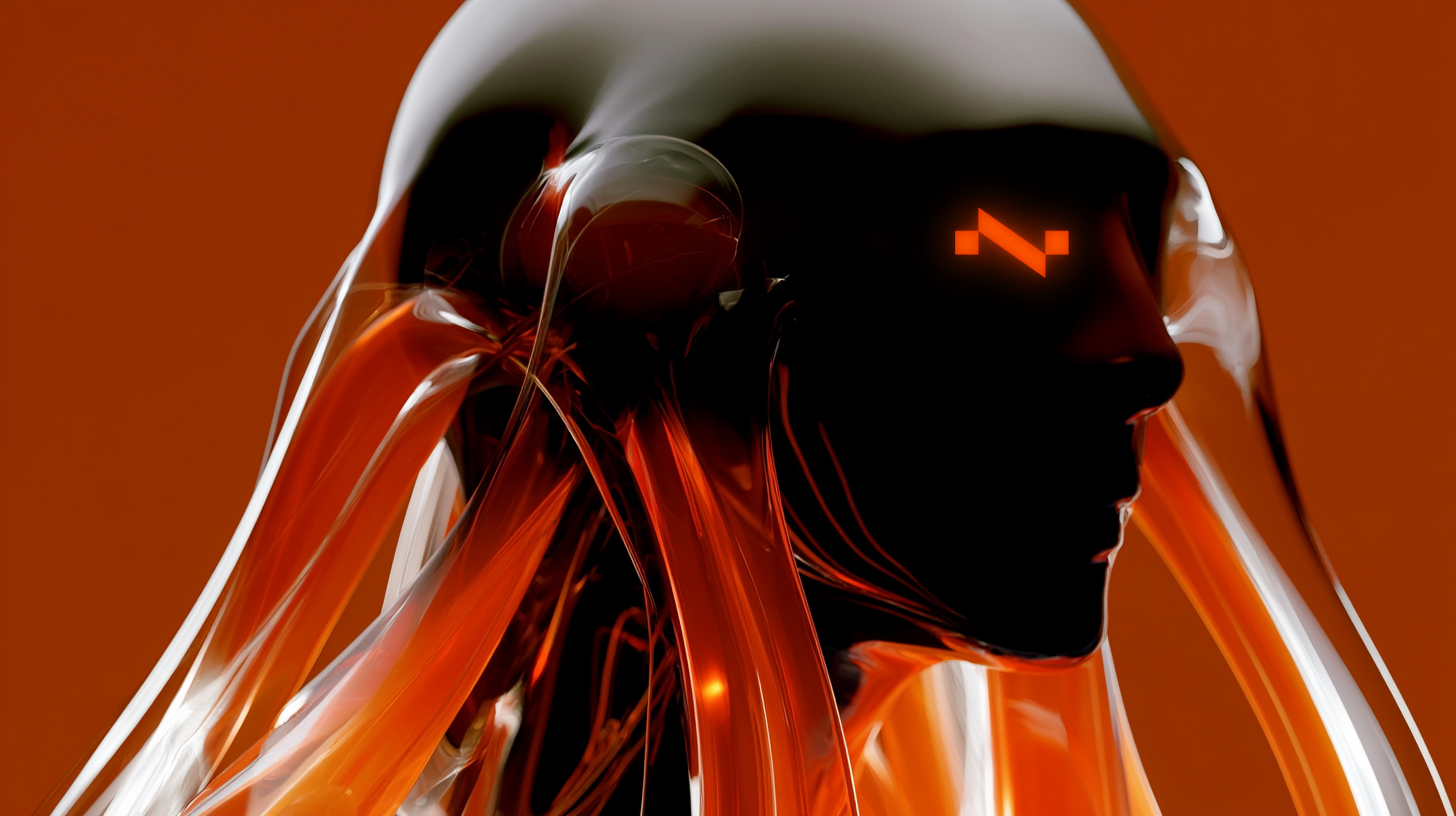
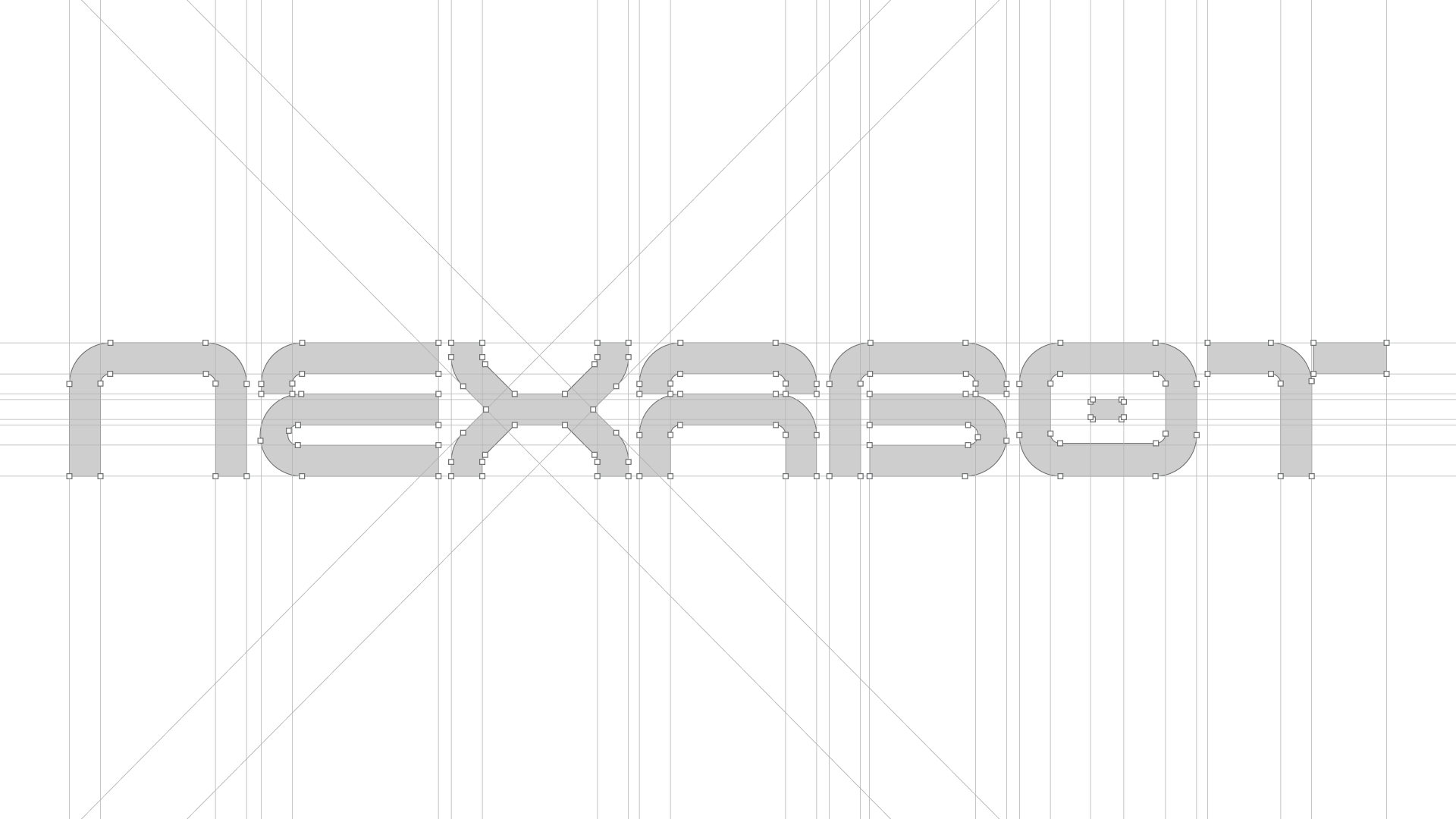
NEXABOT
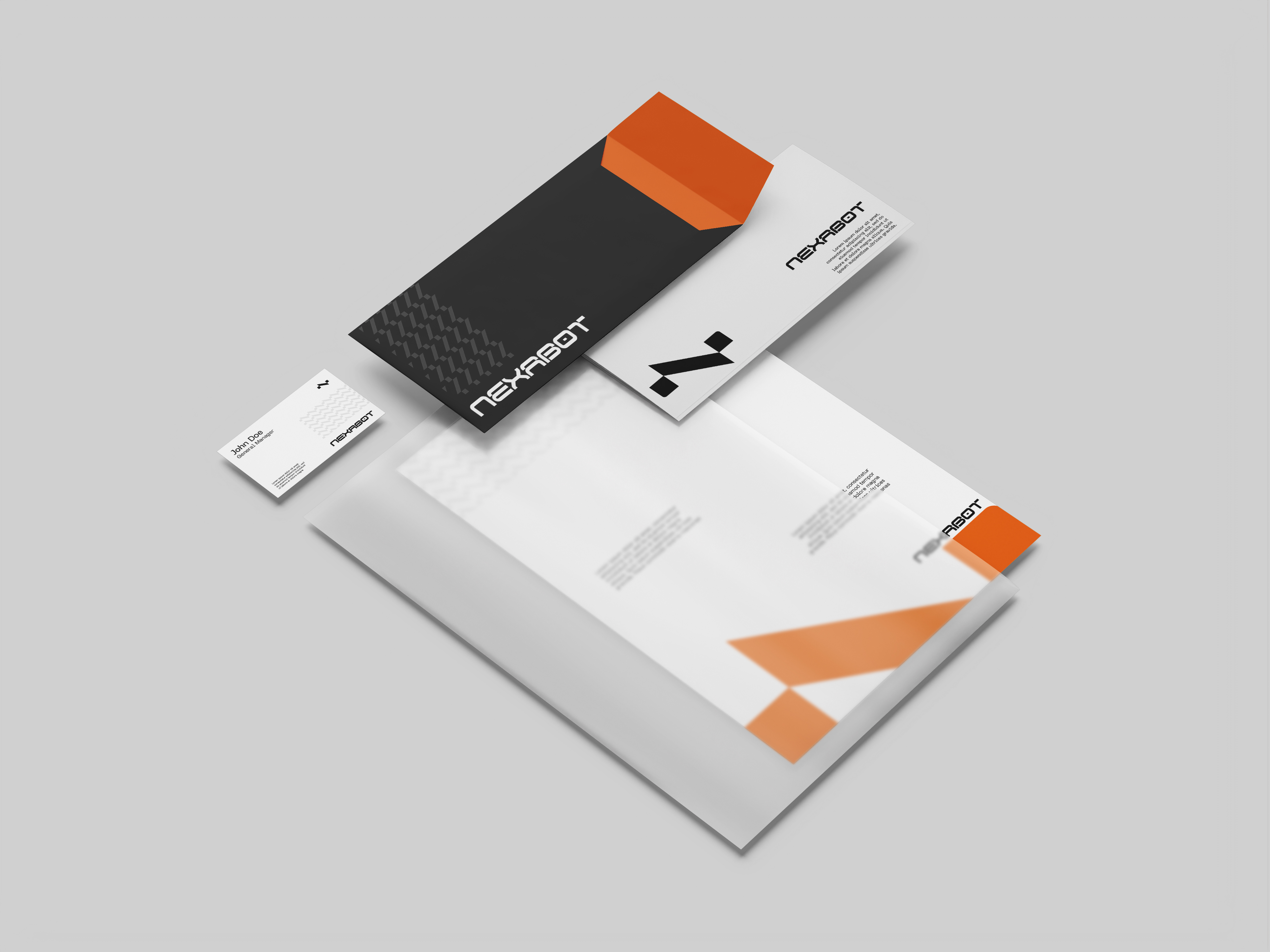
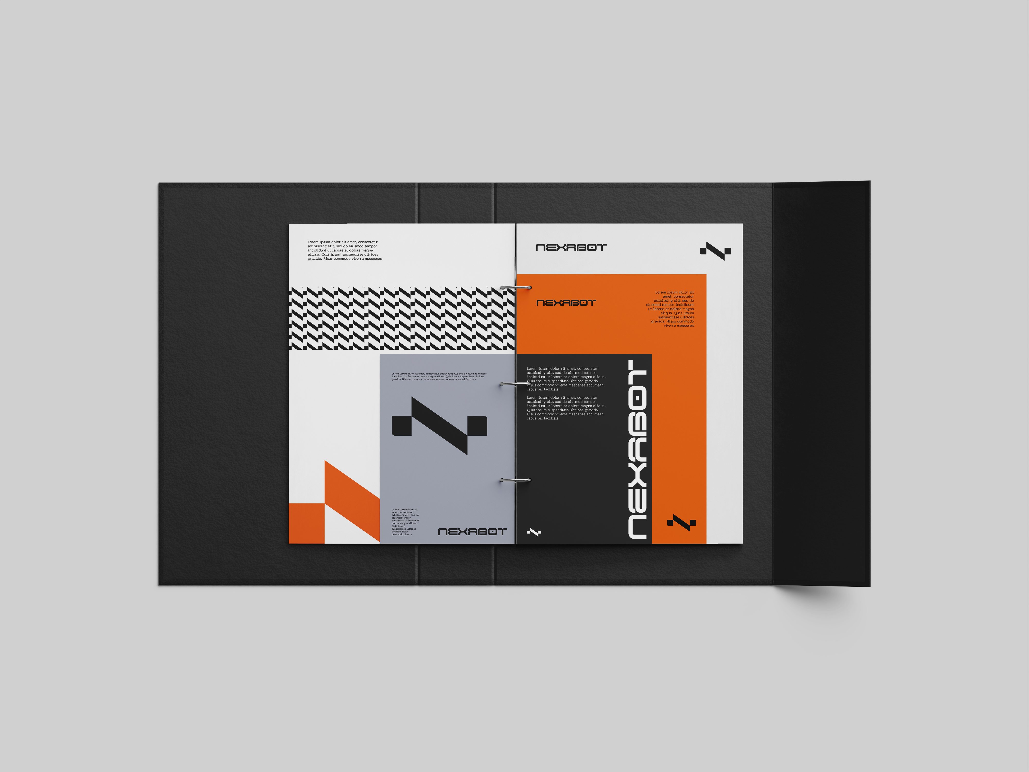
In approaching the visual identity for Nexabot, my objective was to strike a deliberate balance between a bold, futuristic vision and the grounded professionalism required of a leading B2B cybernetics firm . I anchored the design system around a primary logo engineered using the golden ratio, fusing the letter "N" with a dynamic data wave to visually articulate the flow of information and technological synergy . To reinforce this mathematical elegance, I selected Neue Machina as the brand's typographic engine; its sleek, geometric structure perfectly mirrors the utilitarian efficiency of Nexabot's solutions . Finally, the color strategy was designed to reflect the company's internal architecture: vibrant blue and energetic orange represent the organization's two distinct wings—balancing foundational trust with dynamic innovation—while a sophisticated grey grounds the entire ecosystem with corporate maturity .