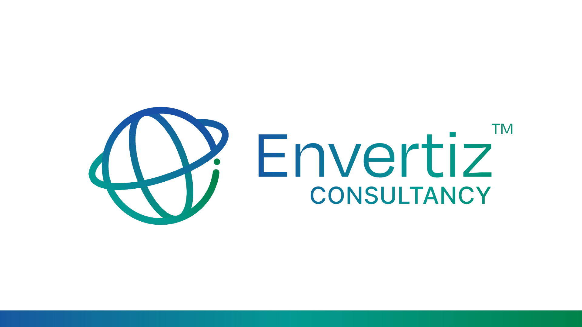
ENVERTIZ


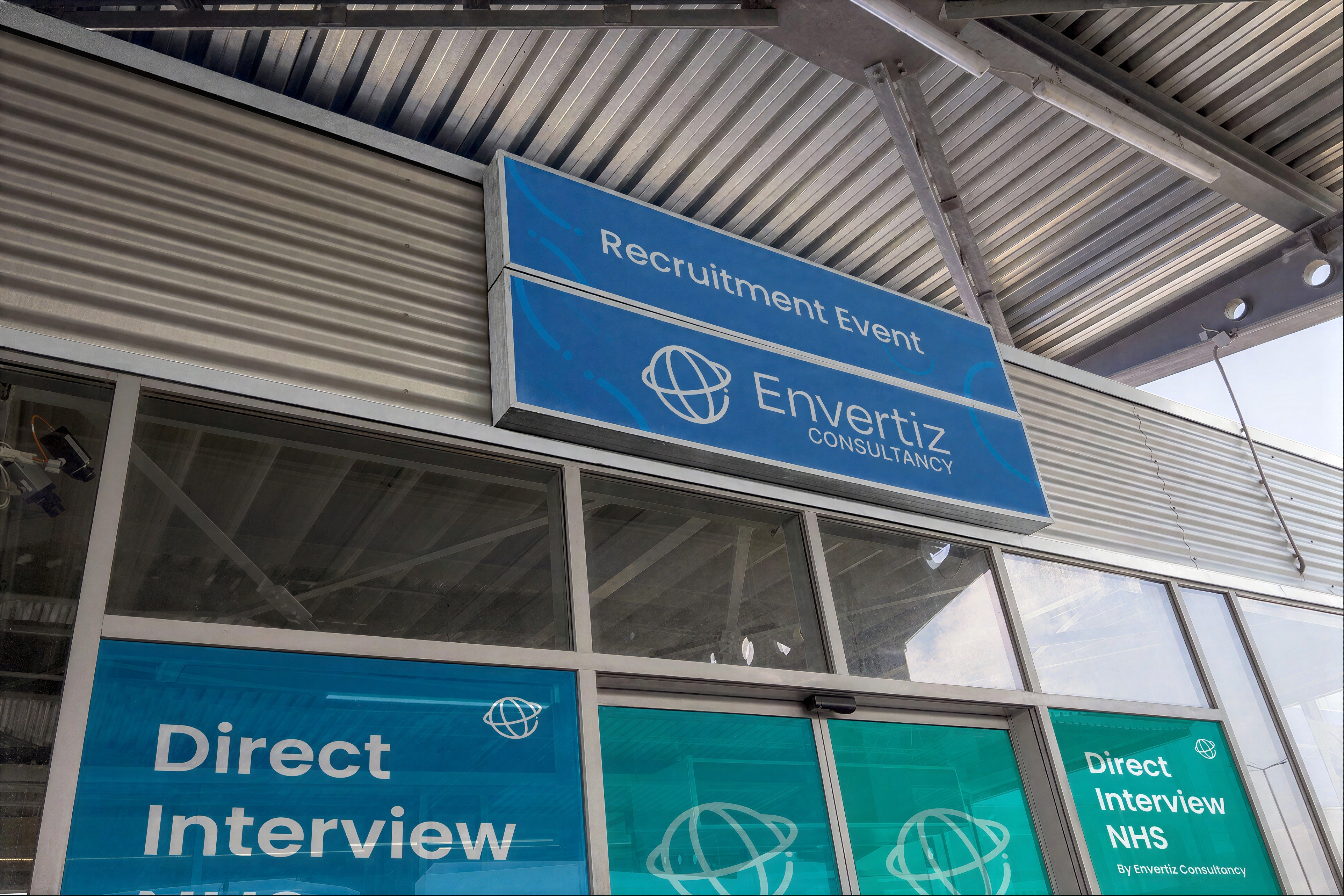
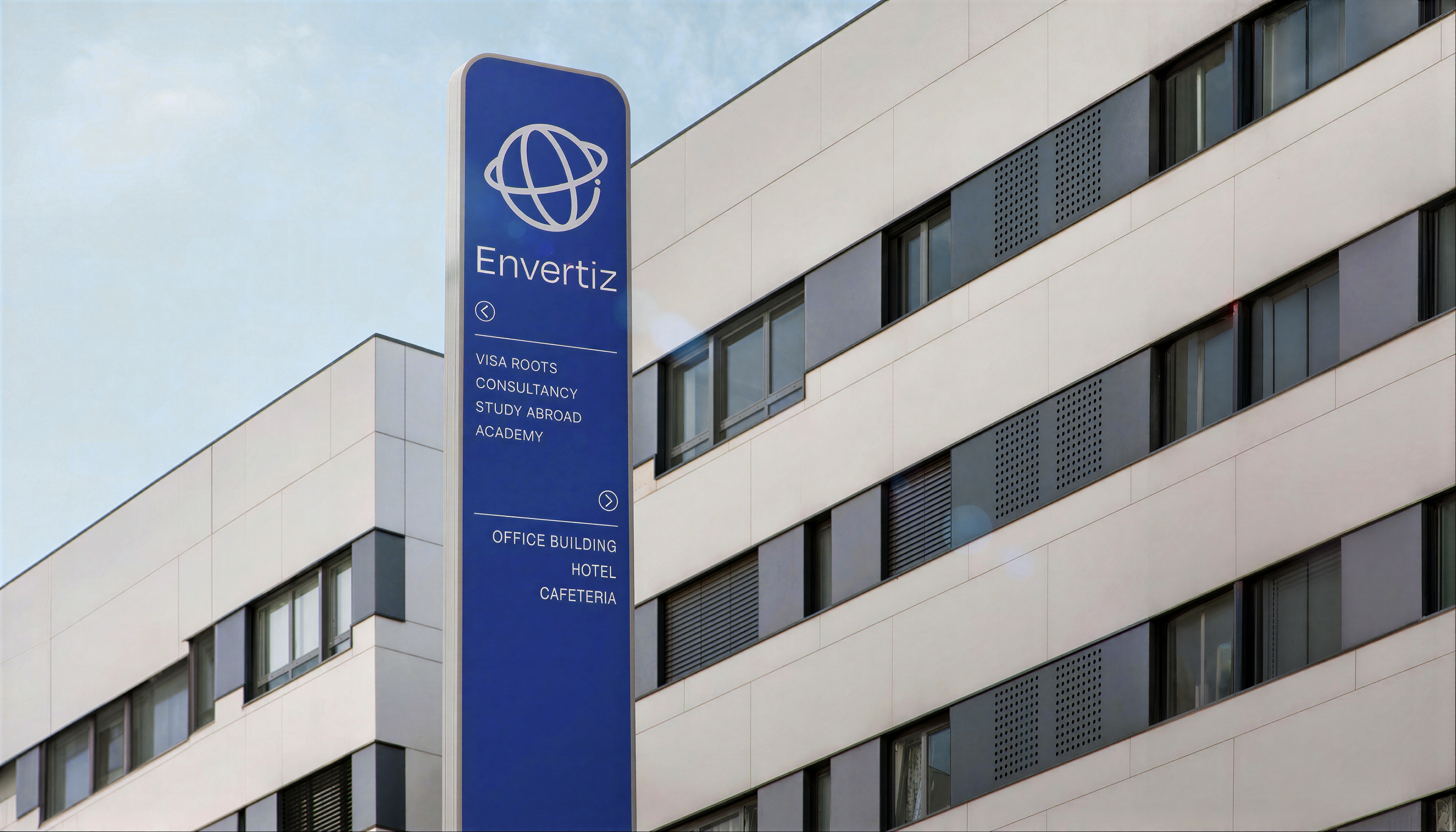
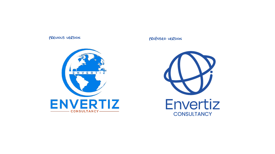
The core philosophy driving the Envertiz rebrand was simple: the organization was not changing, just evolving. As the consultancy expanded its global footprint, it required an identity that could support its future endeavours and enable better, more cohesive brand communication with its audience. Guided by the client's constraint to stay close to the original logo, we approached the design as a strategic evolution rather than a complete overhaul
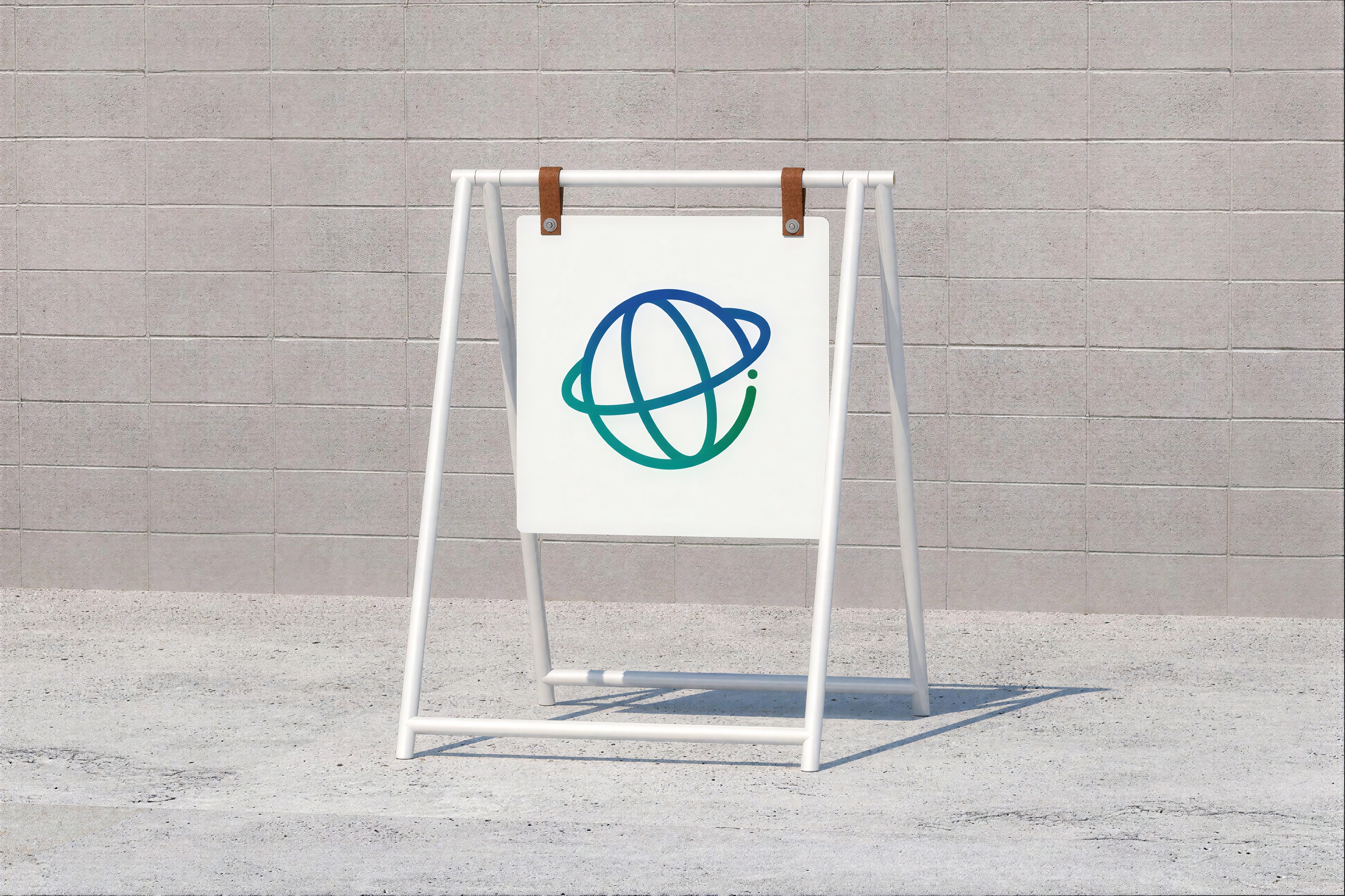
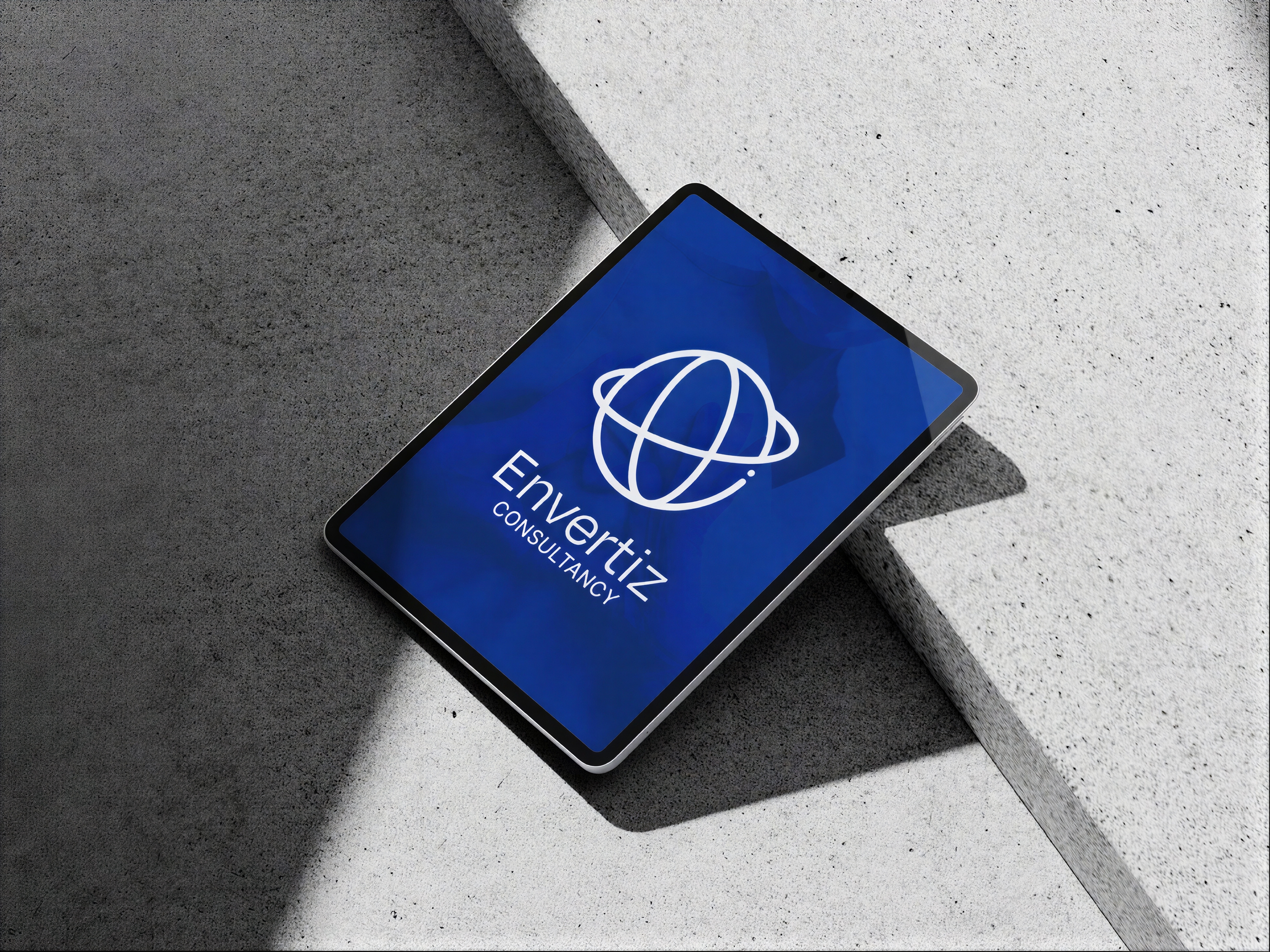
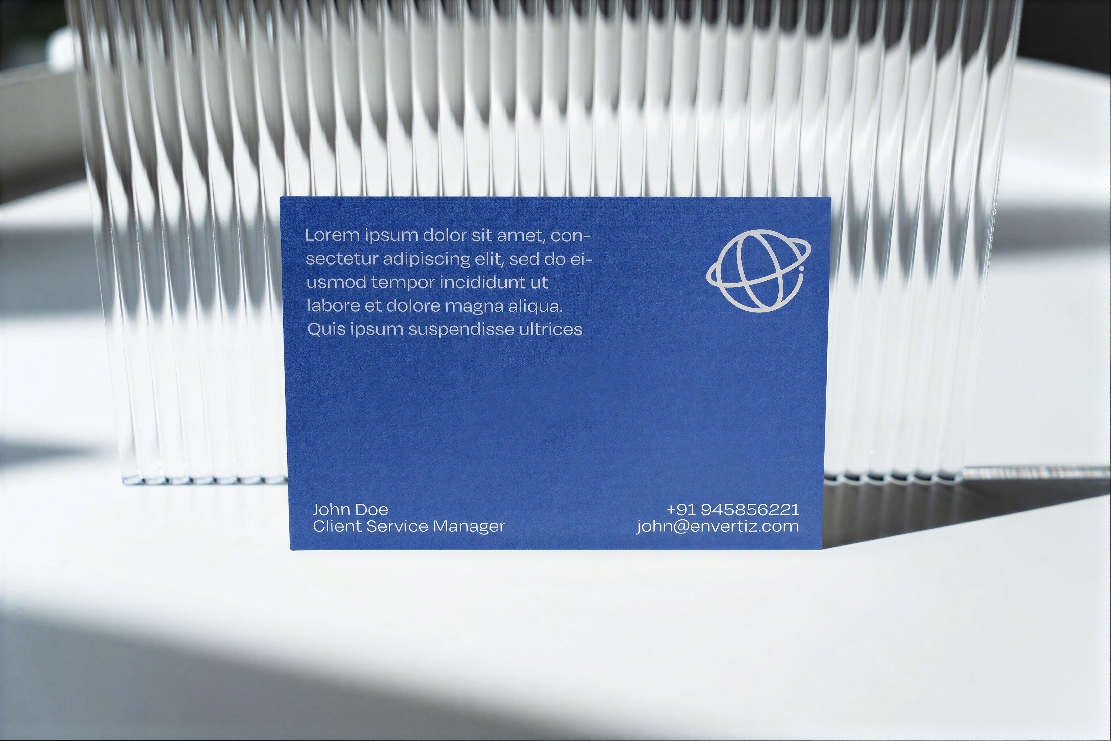
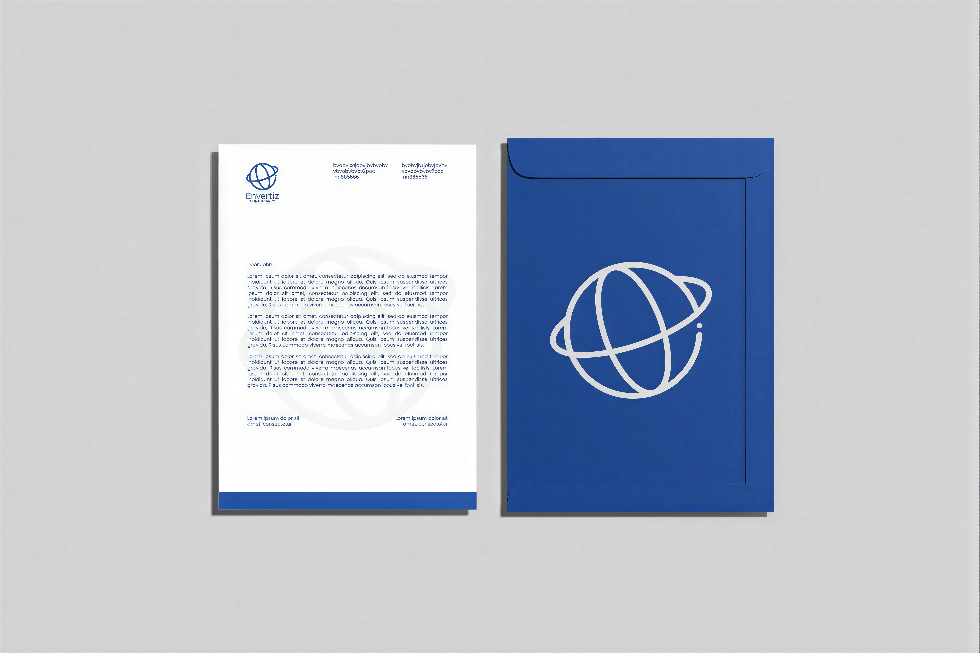
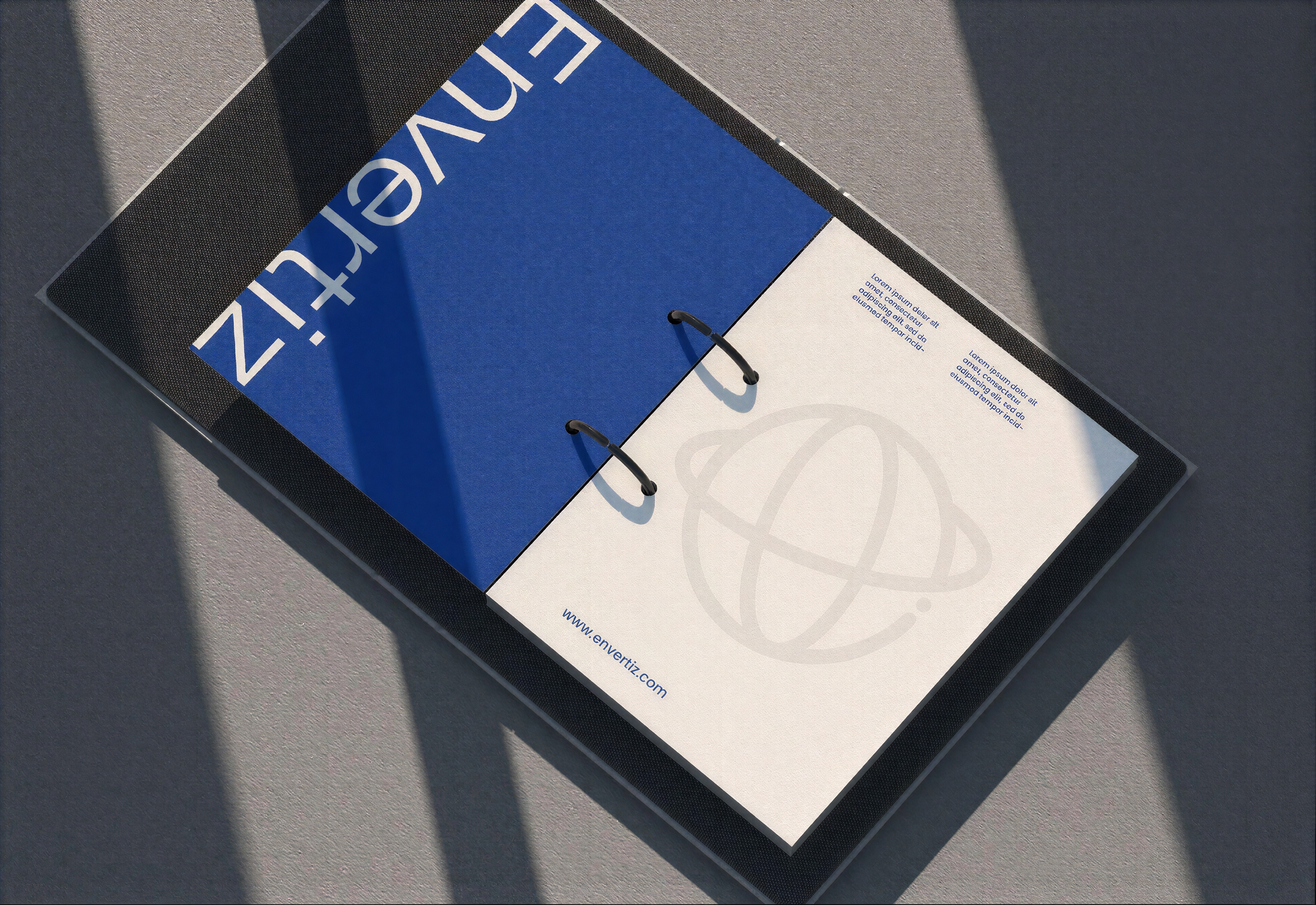
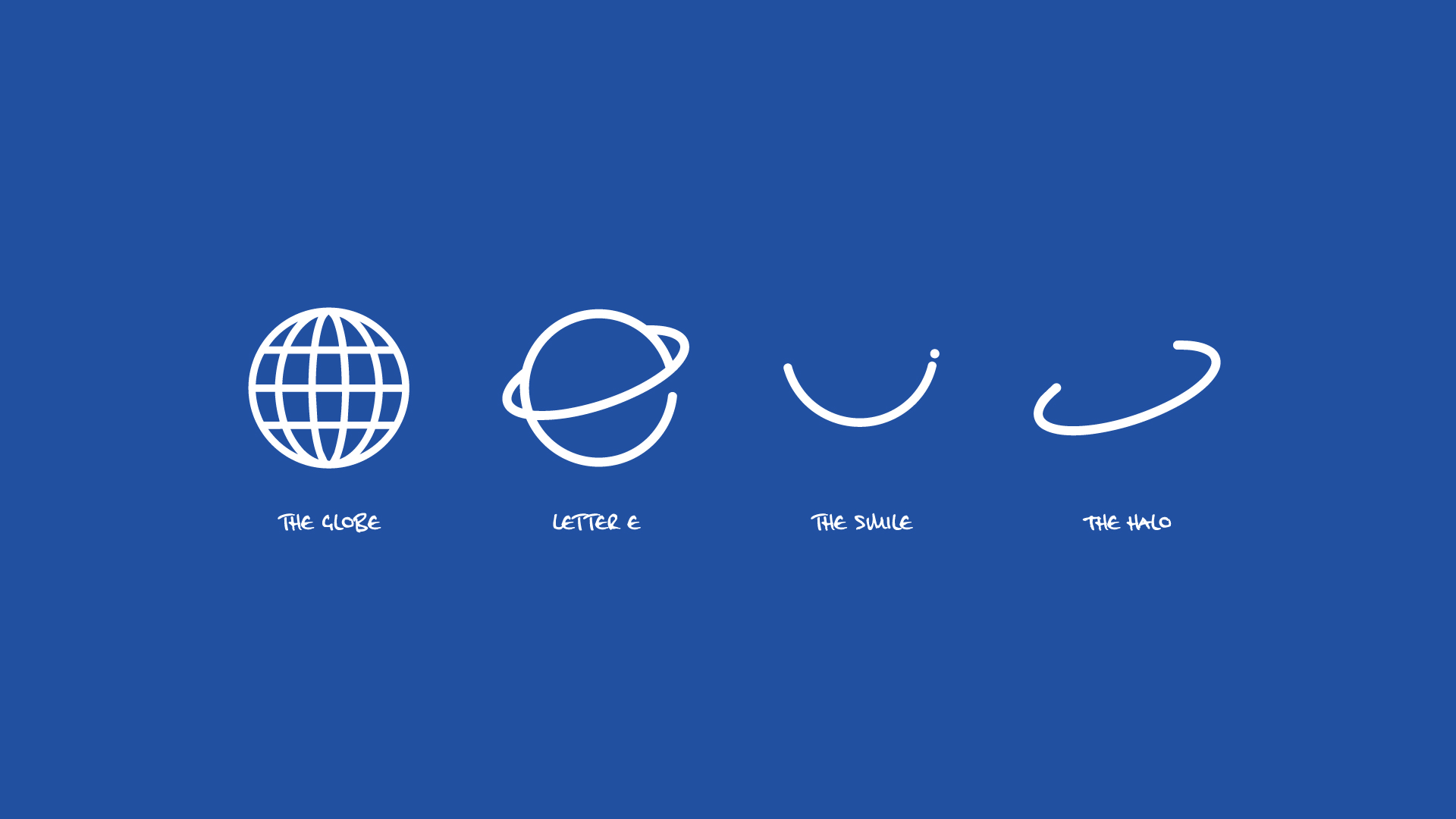
The new minimalist logo mark intelligently weaves together four core concepts: The Globe, The Letter E, A Smile, and The Halo
The new minimalist logo mark intelligently weaves together four core concepts: The Globe, The Letter E, A Smile, and The Halo

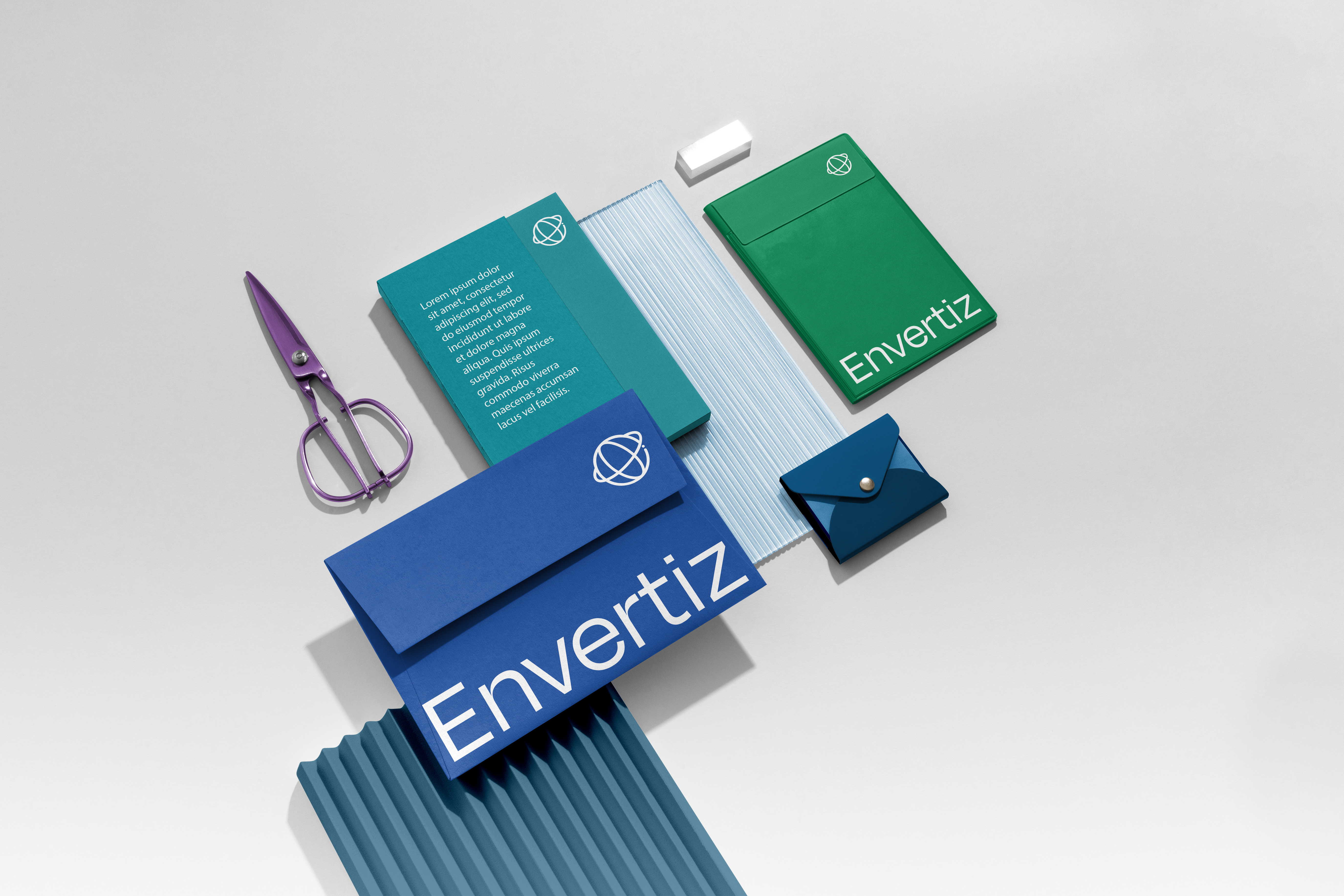
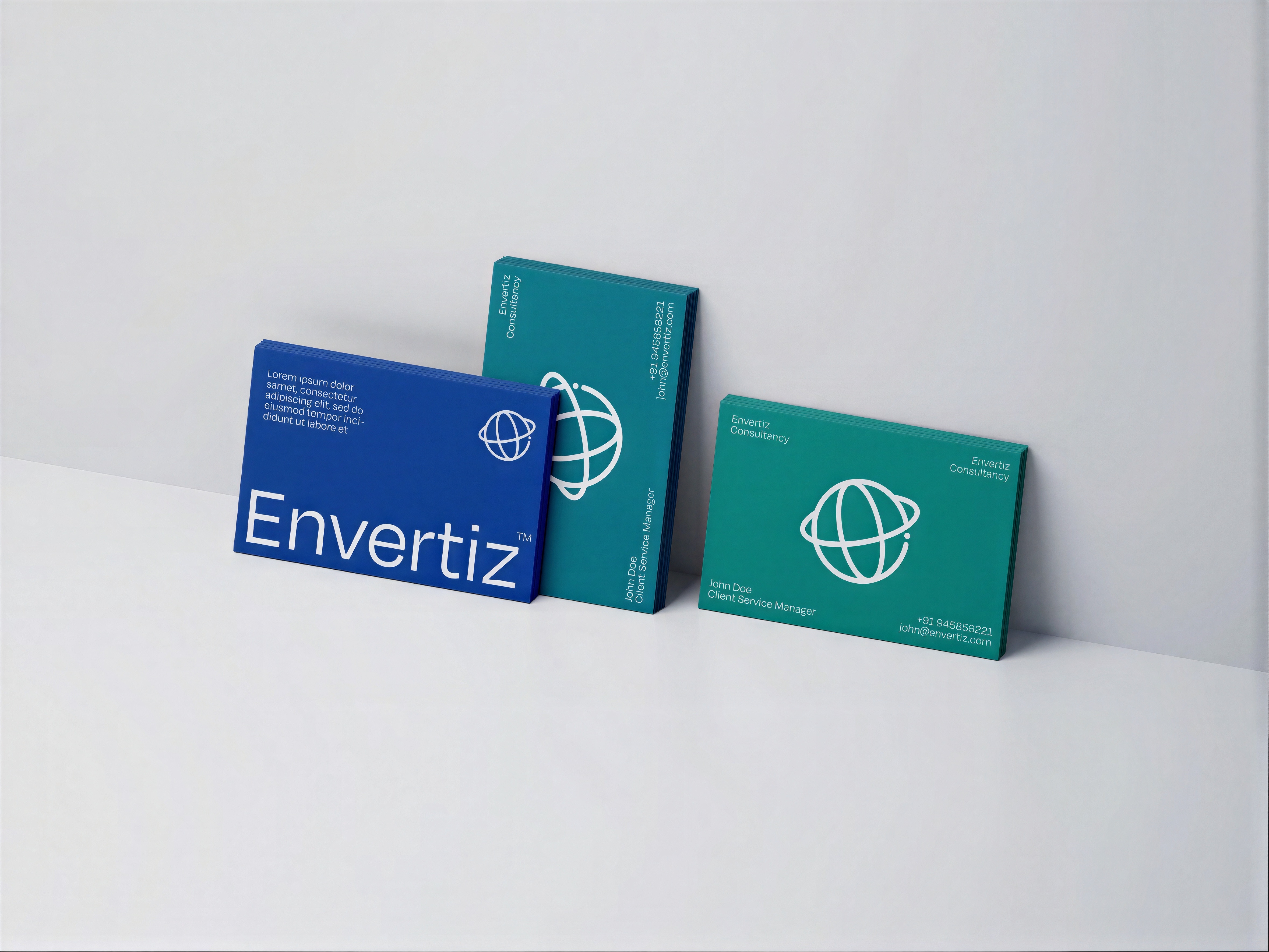
The new Envertiz palette features six unique colors, each strategically chosen to carry its own personality and distinct meaning. Conceived as a direct visual homage to healthcare staff all around the world, the colors are rooted in psychological comfort and professional reliability.