BOHOMONK
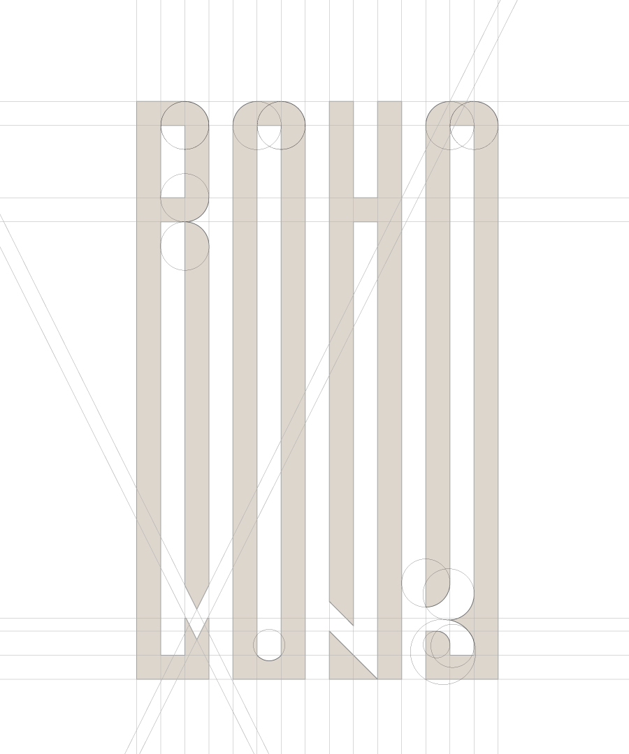
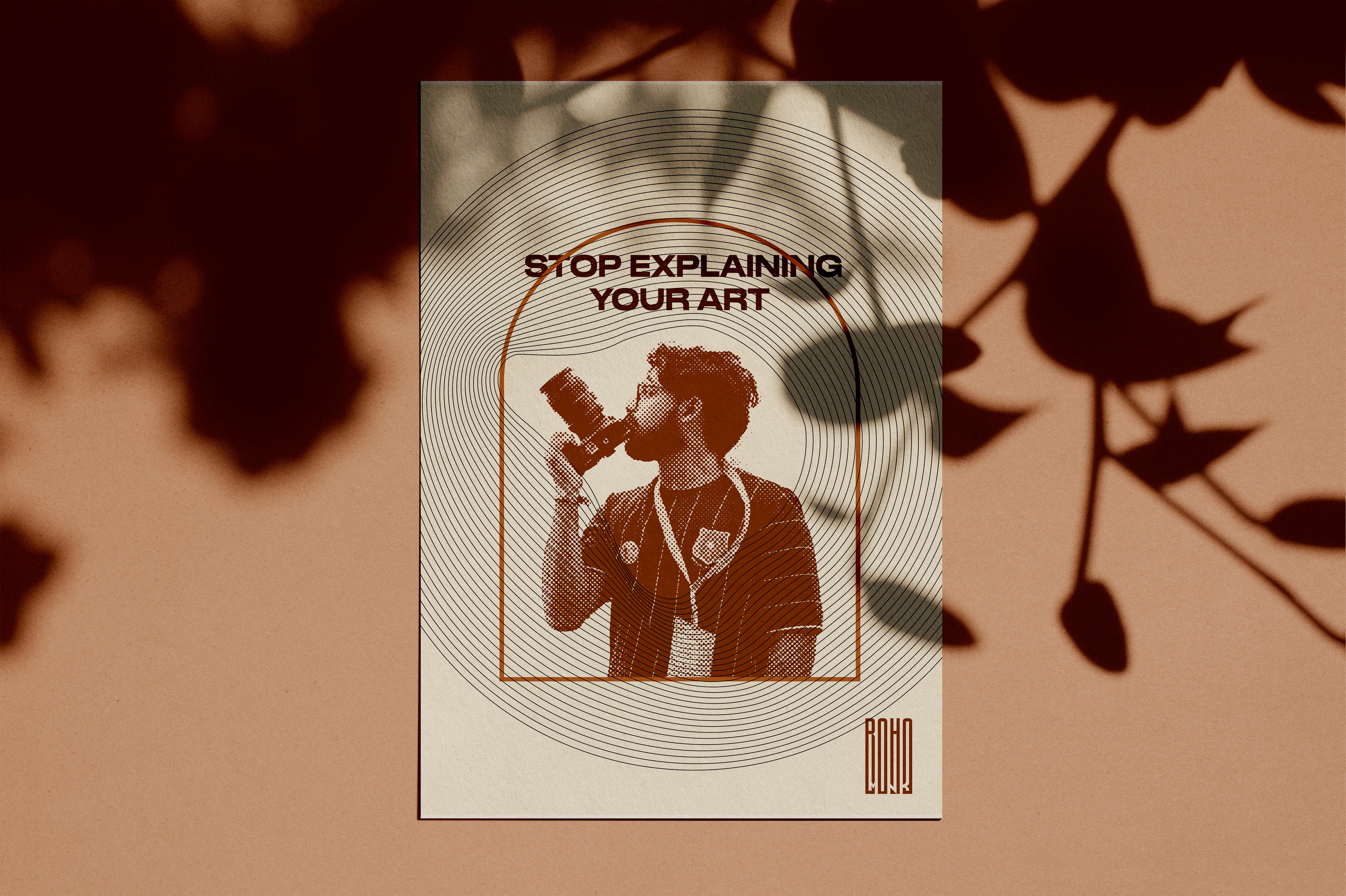
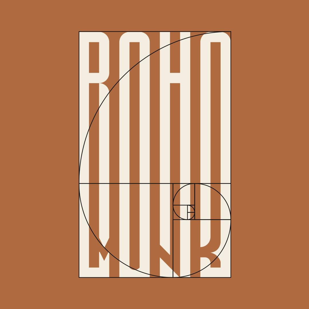
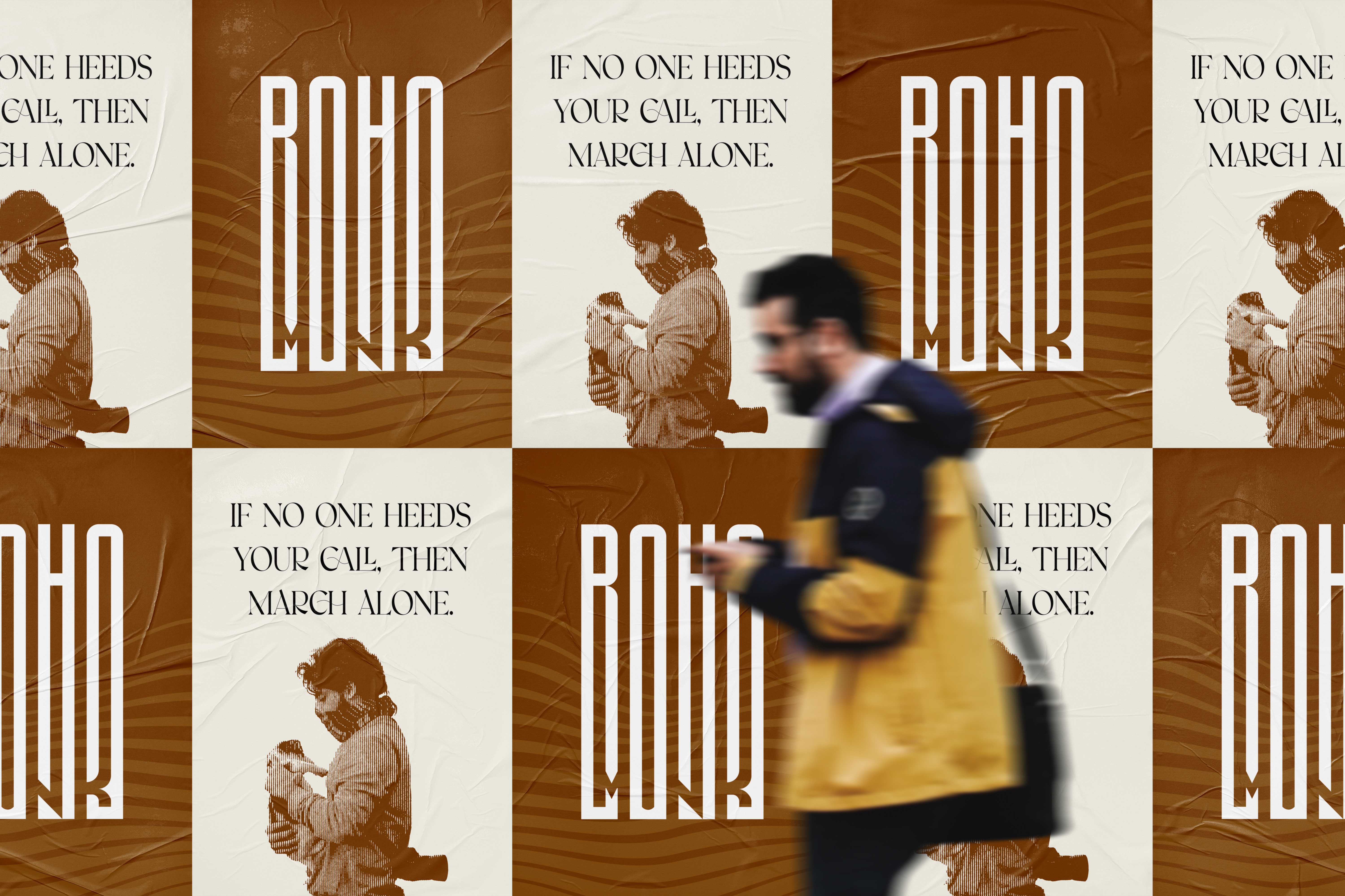
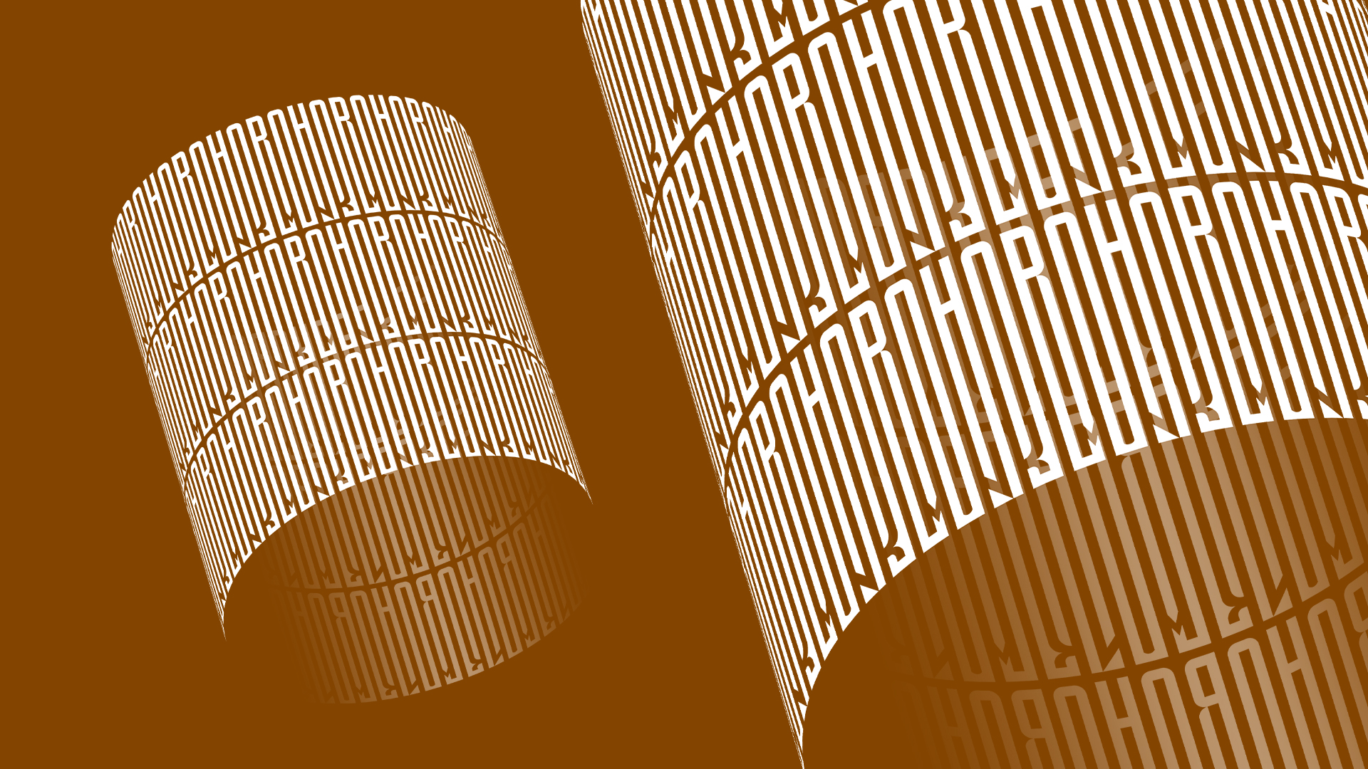
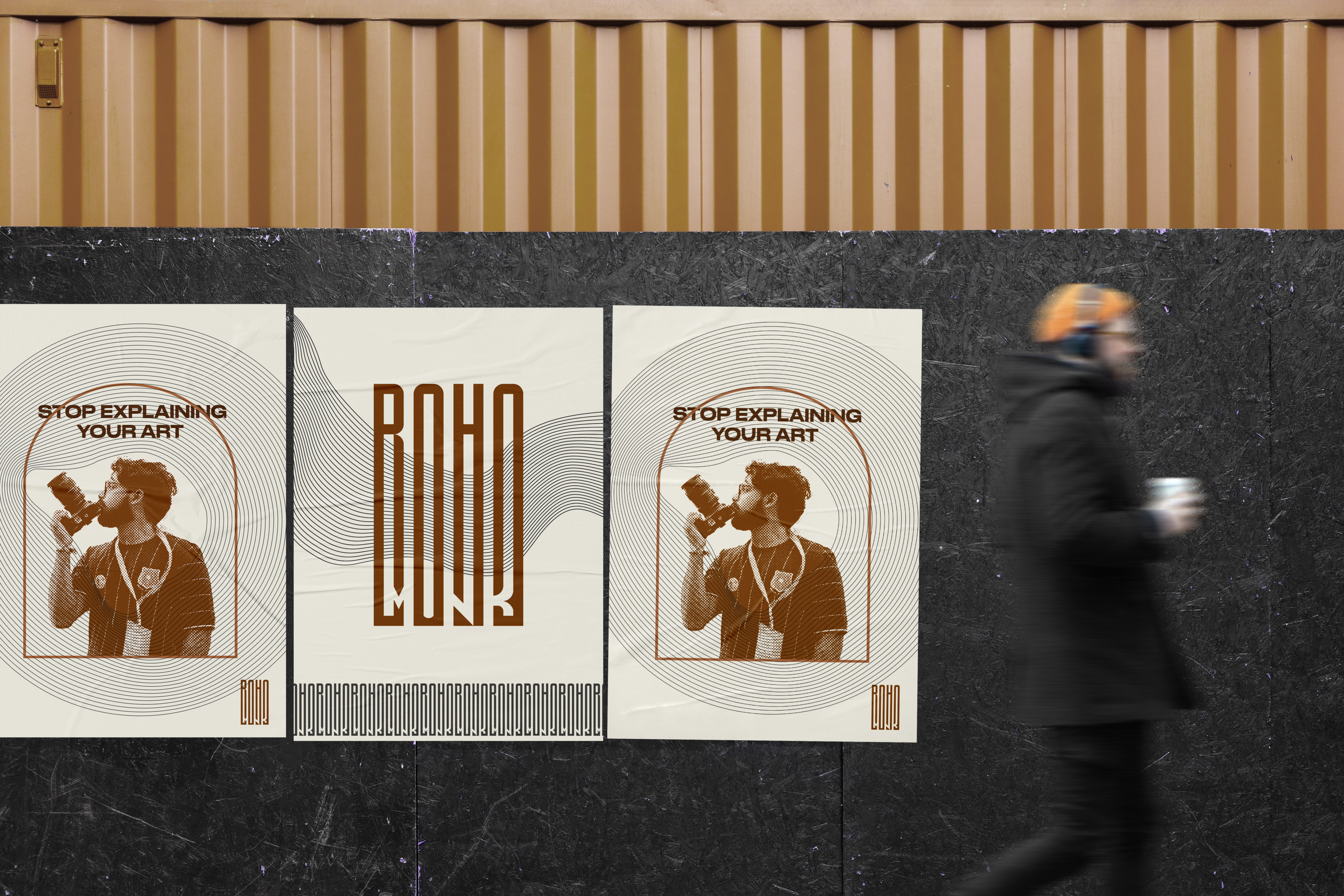
Designed to be inherently intriguing, the core visual identity functions dually as both a legible wordmark reading "bohomonk" and a striking standalone logomark. Crafted using the golden ratio, the vertically condensed typography moves away from standard digital fonts, resulting in a monolithic structure highly reminiscent of ancient, esoteric symbols. This intentional geometry provides immense functional versatility across the brand's ecosystem; when repeated, the architectural, interlocking lines create captivating, textural patterns, and its clean, linear nature allows it to serve seamlessly as an elegant, unobtrusive watermark that protects his fine art and street photography without distracting from the imagery itself.